Opole Kampus
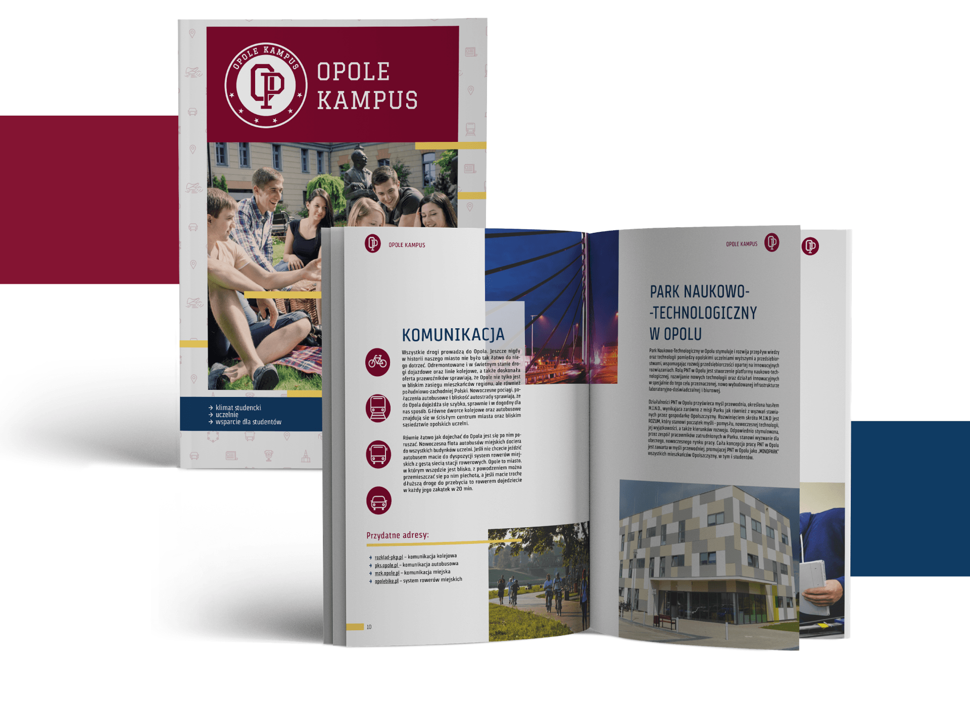
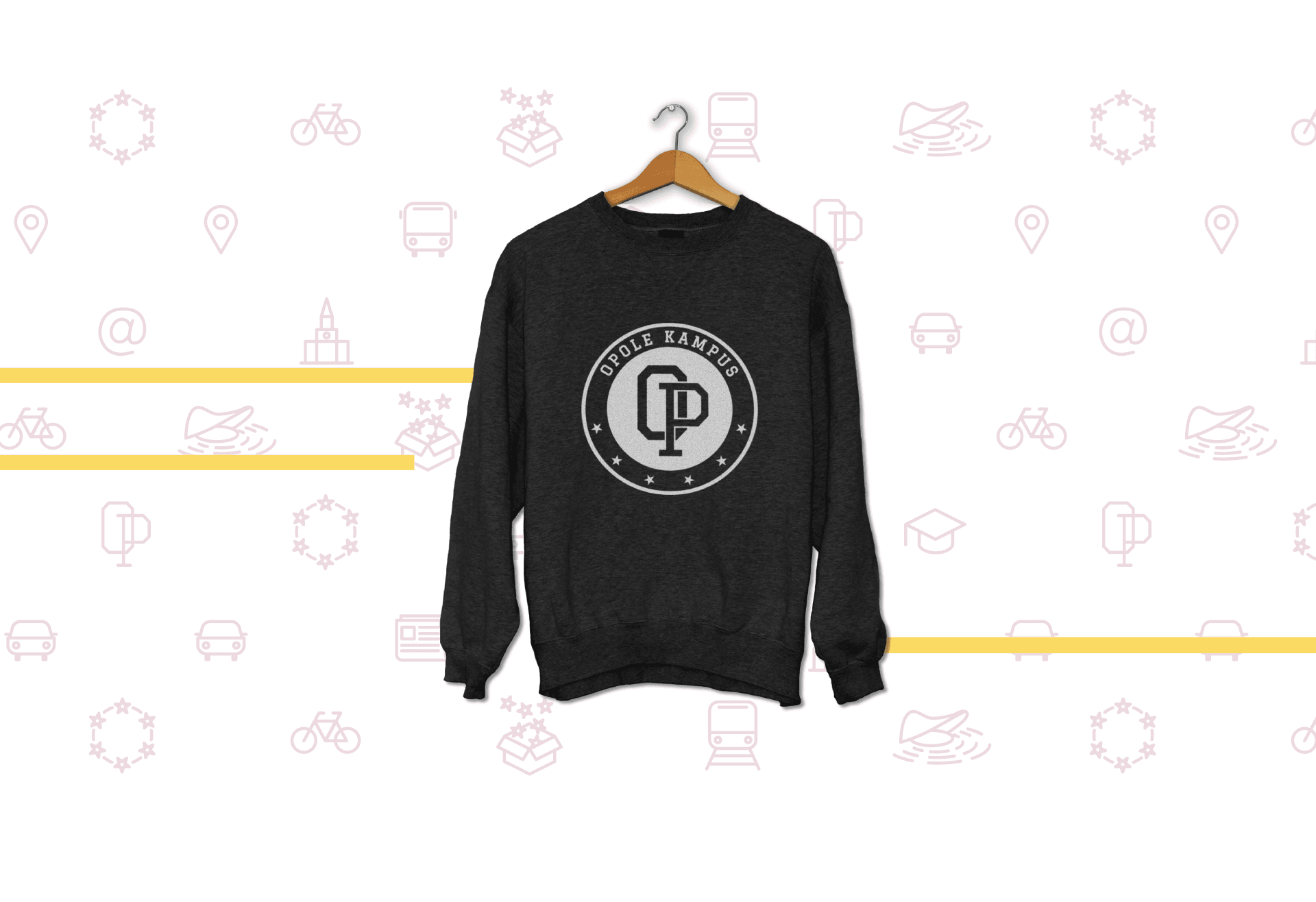
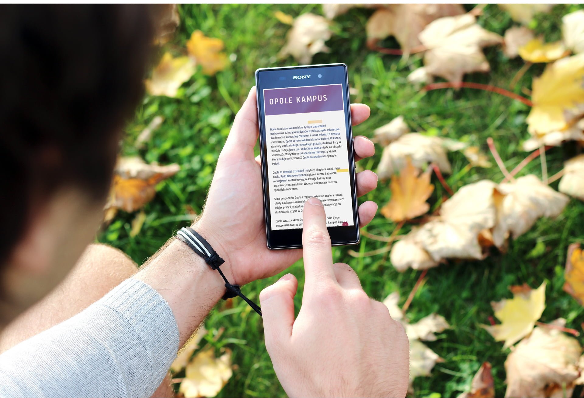
Opole City Council decided to actively encourage young people to study in this beautiful city. How? By referring to the atmosphere of American campuses. Why? Because, thanks to the facilities for students, relaxed atmosphere, numerous entertainment and sports events, American campuses are clearly different from Polish universities. We have developed a name and logotype, referring to the aesthetics of foreign campuses. The next step was to create a full graphic design and adapt it to print materials and the website. The subdued, minimalist aesthetics became a perfect background for important university information and a carrier of important news: this is a modern place!
Type of activity:
City Council
Time of execution:
2 months
The scope of our work:
Name
Logo
Visual identification system
Web site

