Kontra Training Centre
Kontra organizes trainings in occupational health and safety and soft skills. It always goes one step further and tries to meet the expectations of its customers. Occupational health and safety is one thing, but Kontra also builds awareness of the need for a healthy lifestyle – and thus broadens the horizons of training participants.
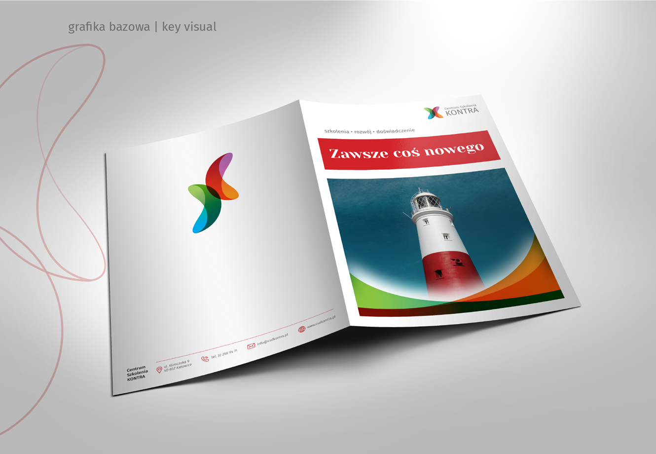
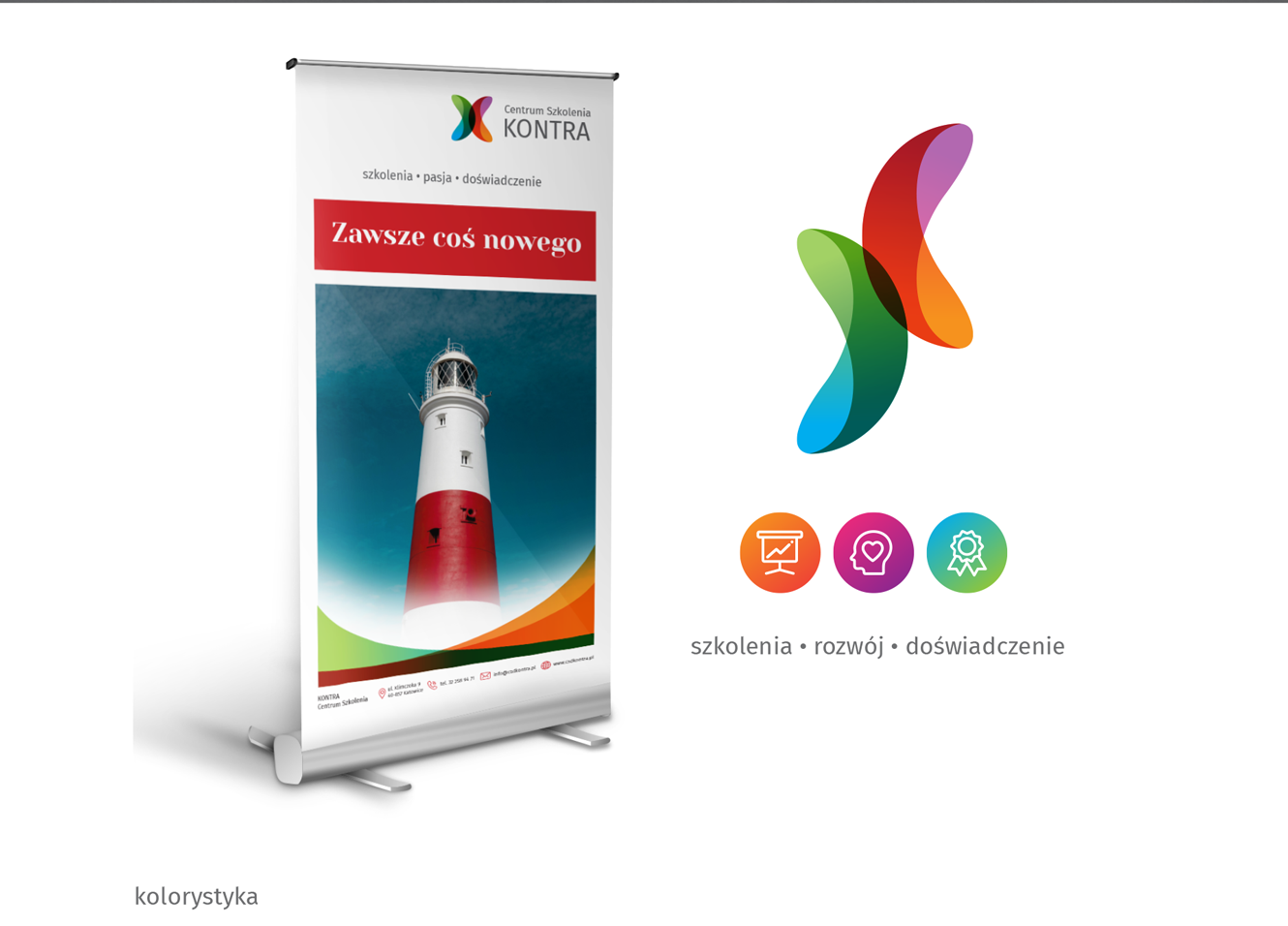
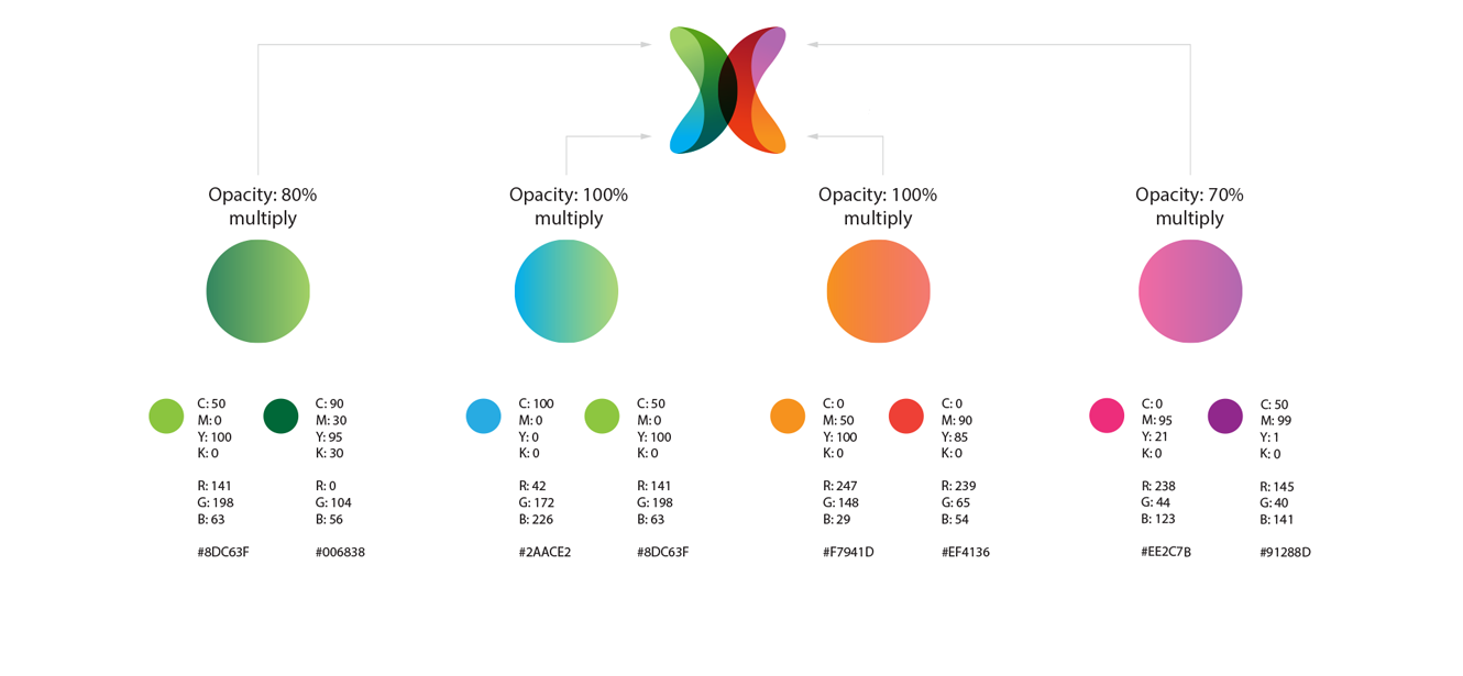
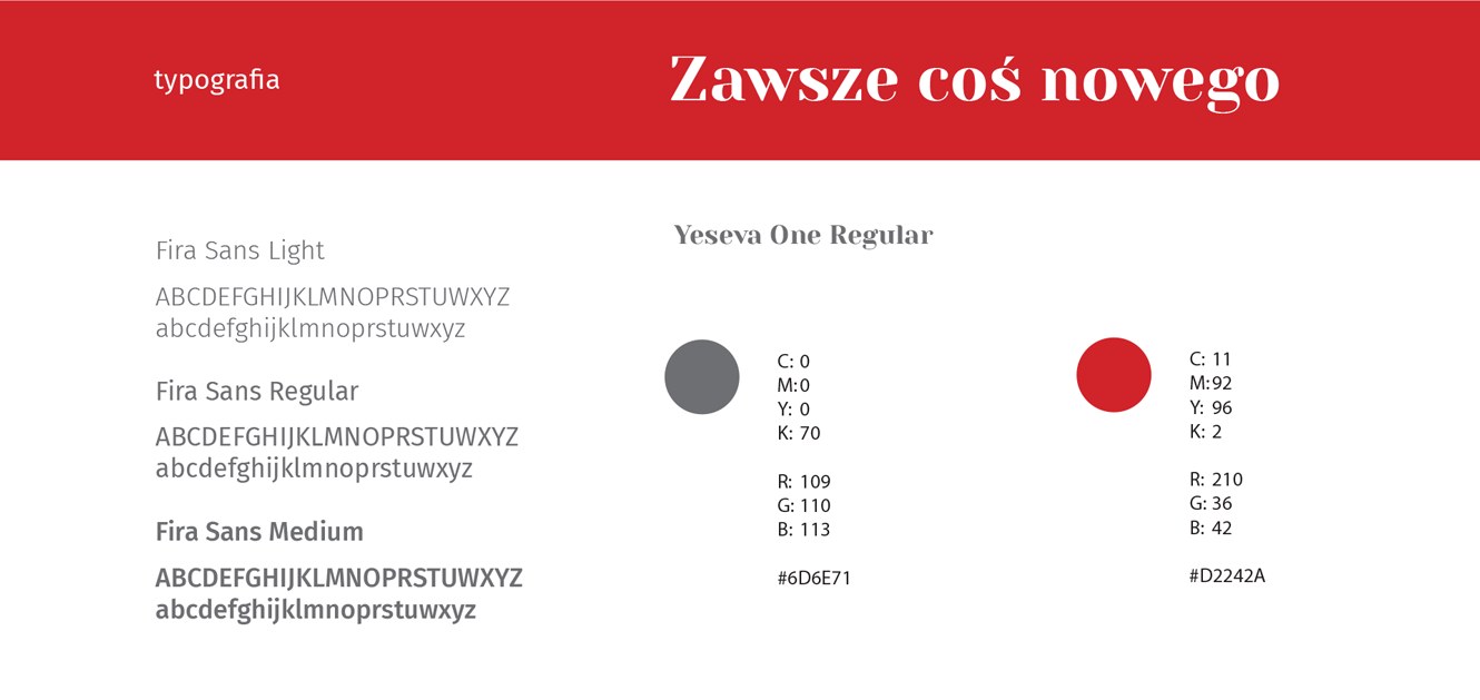
Our challenge was to refresh the logo and design a visual identification system. The new logo and key visual is to clearly communicate the company’s values: creativity, reliability, innovation and … positive energy. After the analysis we designed the new logo. Currently, the sign is a reference to the original logo, that is “K” in the mirror image. It consists of two contrasting colors: warm versus cold. Then we created a key visual based on the “contra – gray reality ” concept to show how colorful and creative Kontra stands out from the competition. The colorful, interpenetrating planes also refer to the letter “K”. We have retained the existing leading colour and slogan. Certainly, the company’s offers in the new graphic design will arouse even greater interest among potential customers.
Type of activity:
Training centre
Time of execution:
2 months
The scope of our work:
Logo lifting
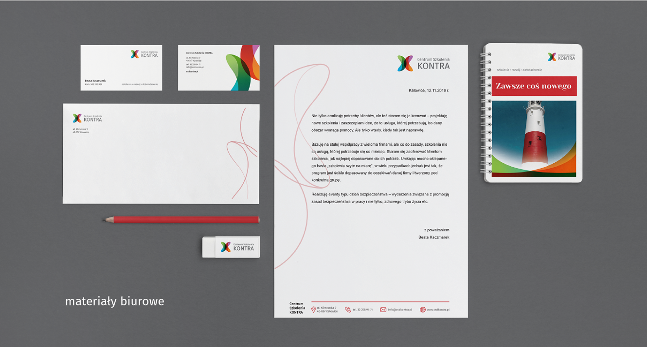
Visual Identity System

